Is Responsive Web Design The Next BIG Thing?
We are going to start this with a twist; a little game that is going to result in putting across the point of this article better. So humor me and play a tad with your browser window. Make it small, smaller, smallest! As lame as it may sound, you are going to see how to the elements of this website change. If you have to zoom in and out to read the text more clearly, you are viewing a static website and if the text size is adjusted accordingly and you need to make no effort, you are viewing a responsive website.
Since you have no way of predicting which device your website is going to viewed on, you are going to have to make the effort to go through your site content a little less for the viewer; and the only way to do that is create a responsive web design.
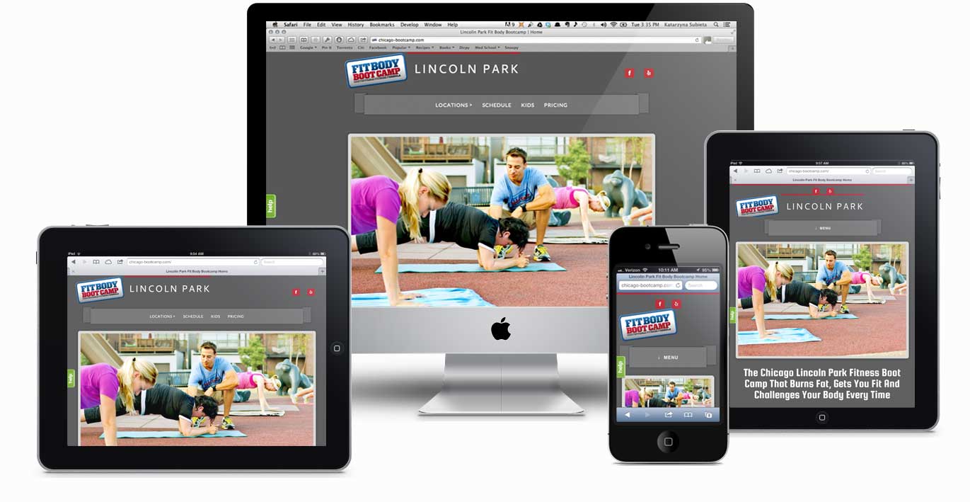
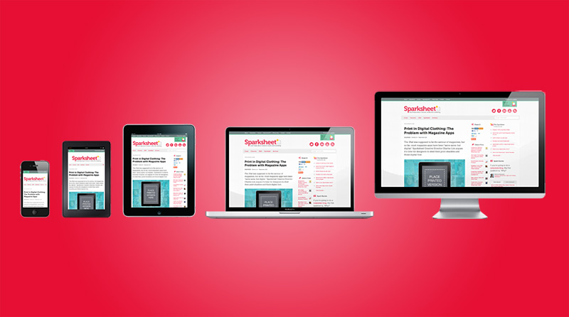
A responsive web design is the one that automatically optimizes the size of all the website elements - text, plugins and extensions according to the device it is being viewed on.
Some of you reading this might be thinking of another alternative to lessening the viewer’s effort - creating a separate mobile site! Well, this can work for a few of you but before you get on to creating one, take into consideration the fact that you’ll have to update content on two platforms and personally I feel that is quite a task!
If you already have a popular business website and changing it to responsive is going to cost you a bomb, I suggest you go ahead with creating a separate mobile site. But if you can and it is feasible, it is always better to create a responsive web design. After a lot of research on what most businesses out there prefer, responsive web design wins hands down.
But why is everyone going Responsive these days?
In a world where everyone is constantly on the go, the chances that your site is going to be viewed on a conventional desktop are very less. Most of your targeted audience visits your site on mobile devices and bounces off if your site doesn’t load well. Not surprised, are we? If your site takes more than 3 seconds to load, there are chances that you have already lost 50% of your traffic and that doesn’t speak well in terms of business conversions. Here are a few benefits of a responsive website:
-
Device friendly. All elements automatically optimize their sizes according to the device the site is being viewed on.
-
No need for plug-ins. There is no separate software or plugin that your visitor will have to install to view your website in the most efficient manner possible.
-
Lesser Investment. Well, you’ll be investing in a responsive web design for your website but apart from that you will not have to invest in creating a separate mobile site for your business.
If a customer wants to interact with your business while on the go, a great experience will not just make it easy for him to do so but also up your sales. The easy navigation and comfort to the eyes of the viewer, are a sure shot way of ensuring he will come back to your website again.
So go responsive to stimulate the response you expect from your target audience!
===========================================================================================
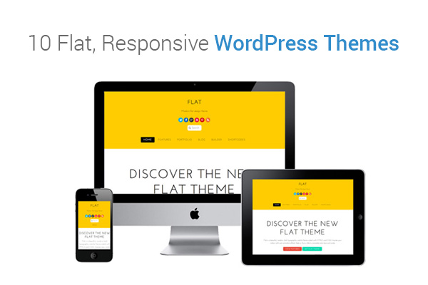
10 Flat, Responsive WordPress Themes
So you have finally decided to work on your next big project, have figured out everything like the blogging platform (obviously, WordPress), and the WordPress hosting to host your website. But are you still uncertain about what sort of a website you want, in terms of design?
Talking about how things are going today, you definitely need a cleaner and more functional interface for your users. Your website has to be as flat as it can be, meaning that the Graphical User Interfaces of your website shouldn’t be too jazzed-up and all. In short, it has to be as minimal as possible. The aim of such a design is to grab the users’ attention.
However, a flat website alone won’t help you, your website has to be responsive as well. This way, the users can view your website across various devices like smartphone, laptops, tablets, etc. A responsive website automatically resizes, shifts the layout and customizes the experience for the user.
Below you can find a list of 10 flat, responsive WordPress themes that you can use:
1. Avalance
Avalance is a simple yet beautiful, WordPress portfolio website theme. This theme is suitable for creative agencies, web and graphic designers, and photographers.
2. Benthos
A perfect WordPress theme for your next online project, Benthos features stunning typography, a great color scheme and custom styling for iThemes Exchange.
Coffee & Cream is a multipurpose WordPress theme which is ideal for portfolios, websites, blogs and vCards. This theme comes jam-packed with cool features like 27 premium widgets, infinite layouts, short codes etc.
4. Cuber
Cuber is a refreshing and modern, responsive minimal WordPress theme which is ideal for small businesses.
5. Edition
Edition is a responsive news and magazine theme perfect for all sort of blogs. With its built-in review system, stunning image features and flexible drag and drop, you can create a perfect website in no time.
6. Felice
Felice is a flexible and beautiful WordPress theme that can be used for any purpose. It’s a fully responsive theme and provides 2-in-1 theme functionality, so you can create a one-page or a multi-page website.
7. Flatsome
Want a kickass WordPress theme for your eCommerce store? Checkout Flatsome. Flatsome is ideal for online retailers.
8. Hypertext
Hypertext is a one-page flat WordPress theme which is ideal for agencies and corporate studios. This dynamic theme is simple to use and easy to build.
9. Mobilee
Mobilee is a fully responsive WordPress mobile theme which supports both Google Play and the App Store. It also offers the option of unlimited colors, changing one single color changes the entire get-up of your website.
10. Persona
Persona is a unique and highly interactive WordPress theme for creating portfolios. This theme is based on a responsive grid and Hybrid framework, and comes packed with modern HTML5 and CSS3 effects.
So what are you waiting for, find the right theme for your website and get set go!